
CRONOBLE
My family's factory

Actually, that photo is an album cover from a famous Dutch band  but that’s another story.
OBJECTIVE
"Time to refresh the look&feel"
In Cronoble they produce typical spanish pre-cooked products since more than 20 years. So we thought it was time to refresh the brand style.

The logo was based on a old portrait and we wanted to keep it somehow to show a familiar company.
I contacted with an expert of this type of illustrations, César Sebastián Díaz, and we started working together.

We kept working in the portrait and see how that could turn into a logo. We also needed to have two versions in positive and negative because otherwise the shadow effect wouldn’t work in both versions.
The tagline they used in the past was «pre-cooked» and that wasn’t in line with the handmade look and feel we were working on so we started thinking in a new descriptor.

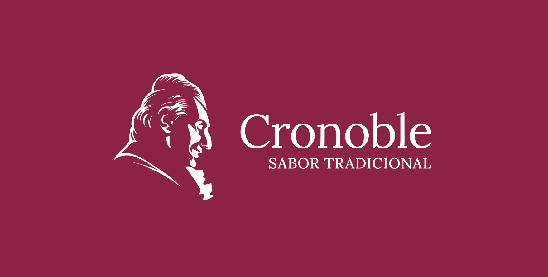
Finally we decided to keep the face for the logo and a full portrait version for larger format as the boxes of the products.
As homemade tagline we decided to use «Traditional Flavour» and as typography Lora to show a classic but modern style.


We created a color system to classify the different products. And in the case of some special products, we applied a custom-made design.